How are your designs coming along? Did you have difficulty coming up with a second round to the little motif? Remember all of those little bits of edgings we made? Try laying them around the base motif. Do they give you ideas? what about overlapping the little bits to see what different effects you can get. Those little bits that were annoying to tat, have now become design tools. You can use any piece of lace already tatted to give you an idea of what you might tat and how it might fit together.
We started asking what it was that was your biggest problem about designing and generally there are 2 main obstacles. Those are primarily, just knowing where to start and knowing how many stitches to use. Designating a small motif as a base to work from eliminates the first one and having little snippets of lace to play around with simplifies the second one.
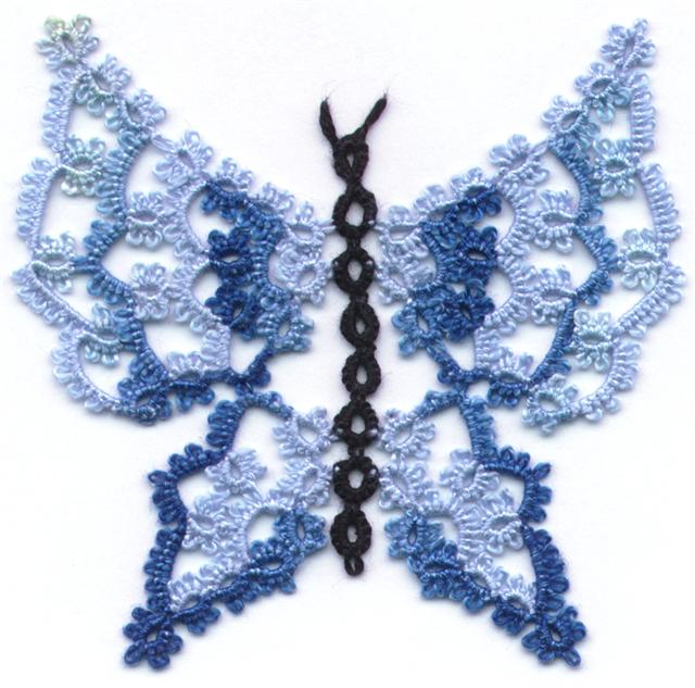
You will have noticed that the base motif has 4 equally spaced picots for joining the second row. That often means that your design will result in 4 equal sides or a square motif. See how easy it is to turn a round design into a square? You could just as easily turn a square design into a round one. Or you could turn it into a heart, or a butterfly, or a snowflake.
Take a critical look at your design. Do you have a nice lace to space ratio? Are segments stretched out, or crammed in? Is the over all shape you ended up with pleasing to look at? Did you insert some variety into your design? Do you have a harmonious design or is it lopsided? Was it a stinker to tat? Some designs give the end results you want, but they're finicky to tat and that's OK if the end result is really worth it. Sometimes a design is complicated to tat and not really all the special when it's done. Think it through again and see if there isn't a slightly different way to do it to give a similar effect. Take a look at you stitch count. People will find that designs that have very repetitive stitch counts more relaxing to tat than designs where they have to keep checking the pattern after every segment. If the design doesn't need weird stitch counts, why use them.
These are the kinds of things you have to think about as a designer. If you are making lace just for yourself, it doesn't matter, but if it's something you want other people to enjoy you have to learn to be thick skinned and look at your work critically. You made it and you like it, but try to see the faults other people will see. If you find the faults before they do, you can correct them, and they'll never know. I'll let you in on a secret, a lot of the wonderful designs you see? They were accidents. Shhh! Don't tell anyone. If it works, just pretend that it's what you were trying for all along.
Thursday, February 4, 2016
Tuesday, January 5, 2016
Lesson 5
In our last lesson we looked at clovers. Compare your results with the ring and chain samples to your clover and chain samples. My apologies for the less than stellar examples here; I did do a new set of examples to show you, but they were swallowed up by the vacuum.

Did you have to make a lot of adjustment on your chain length or a little bit of adjustment. Did changing the size of the side rings change things? Did you have to adjust the chain length to compensate? All of these observations that you make not only with your own tatting but also with that of other pieces of tatting you see, will help as you begin to create your own designs. Sometimes a design doesn’t need a big change, just a little tweak and the things that you learn doing mundane little edgings give you the tools you need when you are working on bigger projects.
One of the things you learn early on is that in something like this design course there is no wrong answer. How could there be? You are the designer, that’s what you’re trying to make so whatever it is, it’s RIGHT. It may look like garbage, but it’s your garbage. If it works for you, it’s RIGHT.
Even if you have never tried to design anything before you actually know more about designing than you think you do. Part of what you learn by doing these simple edgings, is fixing in your own mind what you actually do know. For instance, you have been able to tat several samples from nothing more than a rough diagram. You weren’t given a stitch count, you just worked out something that looked good to you. Each person has their own opinion about what looks good and what doesn’t.
Look at your samples and then look at some of the simple edgings in a pattern book or online. Notice how with even a simple ring and chain edging, that everyone adds their own little twist to it? Then move on to clovers and again you can see how each person puts their own stamp on it and there are as many variations as there are tatters. All different variations, and they all work. Every designer is going to add their unique perspective to what they make. Still, 2 different tatters might work totally independent of one another and yet develop something very similar.
Can you think of some things that you can do to add variety to your tatted edging? We did some tatting with an assortment of different picots and picot lengths. You can also do double picots or add Josephine knots, or make zigzag chains for texture or cluny leaves for solidity. Every additional technique you know allows you to add another dimension to your tatting.
That brings us to our next subject and this is where you really get to play around. This is a little ring and chain doily that I designed. The centre of it is packed with tatting and I could have just continued making the same thing row after row, but we have already seen that too much same-ness is boring. Unlike the ring and chain doilies we looked at earlier, there IS variety here. There are upright rings and rings laying on their side, there are rings on top of chains, there are little rings and big rings, but the picots are just on the chains around the little rings. Still, too much of anything is boring.

When I got to this point of the design I couldn’t think of anything to keep it from being just a mash of stuff crammed into a small space. I knew I needed to let the light in, so instead of going around, I went out. Suddenly, it’s not boring any more. It’s the same repeated theme throughout, but by reaching outward instead of around, it suddenly gains character.

See what happened in between? Lots of negative space. The negative space let’s the eye rest from all the busy-ness of the centre so that it can take in the shape of the design. You don’t even really see the crammed mass of tatting in the centre because your eye is drawn outward to the points. If you go back and browse through doily patterns, the ones that are most appealing often have significant areas of negative space. Negative space gives you breathing room, a rest for the eyes. It separates one area of a design from another and gives the brain a chance to focus on parts of a pattern separately as well as creating design within design.
Note: Repeated themes or repeated motifs are a good idea in a larger project as it brings continuity into the design.
When you begin designing the temptation is to attach your next bit to every available picot. In this next exercise we are going to deliberately create negative space. In creating your negative space, don’t forget to include structure. Bare chain can define an area, creating negative space, but too long a chain without some defining shape will result in a floppy motif. I call them “spaghetti chains” because like spaghetti, they have no more support than a wet noodle. Rings hold their shape and give structure, so a more successful design can be achieved by using a mix of rings and chains or by using split rings or cluny leaves rather than just bare chains. If you can hold your finished motif by one outside element and it holds up, you probably have a good design, if it flops over, you probably have spaghetti chains. That's OK if you plan to add another row to hold it together, but if that's where you plan to stop, you may want to change your design.
We will be working with a very simple ring and chain motif, so we are still working with just rings and chains. Putting negative space into a design is both easy and difficult. It’s easy because it’s empty space. It’s space where there isn’t any tatting. It’s difficult because it means taking a flying leap in your tatting in the hopes that what you do will look good later on. We’re not going to take a flying leap, we’re just going to puddle jump.
You’ll notice in this design that one chain has a picot but the next chain is bare. Your homework is to tat this base motif and then add another row of tatting joining only to the alternate chains. That means that you are going to tat the second row of tatting, OUT, before you go around.

There are two ways of working this as shown in these two samples. First, you can tat the ring and chain ending the first row at the base of the starting ring like the first sample. Second, you can tat the first row ending with a split chain like the second sample. However you end the first row will position your tatting for the next row and help to decide where you go from that point onward.

So where will you go?
As always feel free to add your questions or comments and I will address them.

Did you have to make a lot of adjustment on your chain length or a little bit of adjustment. Did changing the size of the side rings change things? Did you have to adjust the chain length to compensate? All of these observations that you make not only with your own tatting but also with that of other pieces of tatting you see, will help as you begin to create your own designs. Sometimes a design doesn’t need a big change, just a little tweak and the things that you learn doing mundane little edgings give you the tools you need when you are working on bigger projects.
One of the things you learn early on is that in something like this design course there is no wrong answer. How could there be? You are the designer, that’s what you’re trying to make so whatever it is, it’s RIGHT. It may look like garbage, but it’s your garbage. If it works for you, it’s RIGHT.
Even if you have never tried to design anything before you actually know more about designing than you think you do. Part of what you learn by doing these simple edgings, is fixing in your own mind what you actually do know. For instance, you have been able to tat several samples from nothing more than a rough diagram. You weren’t given a stitch count, you just worked out something that looked good to you. Each person has their own opinion about what looks good and what doesn’t.
Look at your samples and then look at some of the simple edgings in a pattern book or online. Notice how with even a simple ring and chain edging, that everyone adds their own little twist to it? Then move on to clovers and again you can see how each person puts their own stamp on it and there are as many variations as there are tatters. All different variations, and they all work. Every designer is going to add their unique perspective to what they make. Still, 2 different tatters might work totally independent of one another and yet develop something very similar.
Can you think of some things that you can do to add variety to your tatted edging? We did some tatting with an assortment of different picots and picot lengths. You can also do double picots or add Josephine knots, or make zigzag chains for texture or cluny leaves for solidity. Every additional technique you know allows you to add another dimension to your tatting.
That brings us to our next subject and this is where you really get to play around. This is a little ring and chain doily that I designed. The centre of it is packed with tatting and I could have just continued making the same thing row after row, but we have already seen that too much same-ness is boring. Unlike the ring and chain doilies we looked at earlier, there IS variety here. There are upright rings and rings laying on their side, there are rings on top of chains, there are little rings and big rings, but the picots are just on the chains around the little rings. Still, too much of anything is boring.
When I got to this point of the design I couldn’t think of anything to keep it from being just a mash of stuff crammed into a small space. I knew I needed to let the light in, so instead of going around, I went out. Suddenly, it’s not boring any more. It’s the same repeated theme throughout, but by reaching outward instead of around, it suddenly gains character.
See what happened in between? Lots of negative space. The negative space let’s the eye rest from all the busy-ness of the centre so that it can take in the shape of the design. You don’t even really see the crammed mass of tatting in the centre because your eye is drawn outward to the points. If you go back and browse through doily patterns, the ones that are most appealing often have significant areas of negative space. Negative space gives you breathing room, a rest for the eyes. It separates one area of a design from another and gives the brain a chance to focus on parts of a pattern separately as well as creating design within design.
Note: Repeated themes or repeated motifs are a good idea in a larger project as it brings continuity into the design.
When you begin designing the temptation is to attach your next bit to every available picot. In this next exercise we are going to deliberately create negative space. In creating your negative space, don’t forget to include structure. Bare chain can define an area, creating negative space, but too long a chain without some defining shape will result in a floppy motif. I call them “spaghetti chains” because like spaghetti, they have no more support than a wet noodle. Rings hold their shape and give structure, so a more successful design can be achieved by using a mix of rings and chains or by using split rings or cluny leaves rather than just bare chains. If you can hold your finished motif by one outside element and it holds up, you probably have a good design, if it flops over, you probably have spaghetti chains. That's OK if you plan to add another row to hold it together, but if that's where you plan to stop, you may want to change your design.
We will be working with a very simple ring and chain motif, so we are still working with just rings and chains. Putting negative space into a design is both easy and difficult. It’s easy because it’s empty space. It’s space where there isn’t any tatting. It’s difficult because it means taking a flying leap in your tatting in the hopes that what you do will look good later on. We’re not going to take a flying leap, we’re just going to puddle jump.
You’ll notice in this design that one chain has a picot but the next chain is bare. Your homework is to tat this base motif and then add another row of tatting joining only to the alternate chains. That means that you are going to tat the second row of tatting, OUT, before you go around.
There are two ways of working this as shown in these two samples. First, you can tat the ring and chain ending the first row at the base of the starting ring like the first sample. Second, you can tat the first row ending with a split chain like the second sample. However you end the first row will position your tatting for the next row and help to decide where you go from that point onward.

So where will you go?
As always feel free to add your questions or comments and I will address them.
Wednesday, November 25, 2015
Lesson 4
We’ve already looked at the effect picots have on your lace, now let’s look at the effect the placement of the joins have on it. Typically the joins are made at the waist or middle of the rings and it results in a more or less straight piece of lace. Like the first sample shown here.

On the second sample, the joins are made above the waist and instead of a straight line of lace, the rings are pulled upward so that the edging curves and the chains are pulled straighter. Tat a long enough edging and it will result in a circular medallion rather than a straight edging. The rings are the same size and the chains are the same length, but the look is different.

On the last sample, the joins are below the waist and the rings are pulled downward so that the chains fold and begin to overlap. So you can see that a shorter chain would be more effective.

When you are designing, sometimes you need to change the size of a ring or the length of a chain in order for everything to fit together. Other times, all you need to do is change where you make the join.
I have heard tatters say that they routinely make their joining picots just barely large enough to make the join, as if joining picots should be invisible. Years ago, before the invention of joins, the tatting was made and the sections were held together by tying knots through the picots with very fine thread. The smaller the picot, the less evident those knots would be, so it made sense to make them small.
Now, when we make animals, butterflies, leaves and other things than doilies, those picot spaces form part of the design and making them really small can actually detract from the over all appearance of the lace. In my opinion, joining picots should just be the normal size of your average picots. You may feel differently, and that’s your choice, because you are the designer. However, as a beginner, if you use more picots than necessary, and make them all the same size, you give yourself more joining options. Of course, if you need to make a join and there isn’t a picot, you can always just wiggle a hook under the stitch and make the join anyway.
Like many of us, I didn't have the benefit of learning tatting surrounded by other tatters and consequently I am mostly self taught. I had already learned how to knit and crochet before I learned to tat and I just did whatever seemed logical. With the advent of the internet I discovered that not all tatters do things the same way and most of the time it doesn't really matter. For example some people like to do front side / back side tatting and some don't, but when you look at a finished project that's not going to be what matters to you. It's just a detail. Similarly some people pull a loop of thread up to do a join and some people push a loop down to do it. In the finished lace nobody is going to care which way you did it as long as you are consistent.
Here's something to be aware of. When making a join some people count the join as the first half of a stitch and some people consider it as just a join and do a full double stitch after the join. Most of the time it won't make any difference because it's just one half stitch. BUT if you create a design where a ring has multiple joins, and you count the join as the first half of the stitch, with each join you lose a half stitch. Two joins and you lose two half stitches, or a whole stitch. Four joins and you lose two full stitches. You're going to notice 2 missing stitches. If you're following a pattern, you have to follow the instructions, but as a designer you have to think in terms of other people tatting differently than you do.
As the designer, if you count the join as the first half stitch, you might just add in 2 more stitches to make the ring the same size as other rings which don't have multiple joins. But then the tatter who doesn't count the join as the first half stitch will end up with 2 extra stitches and a ring that's a little too large. So what do you do if just the way a tatter tats might give them different results? If counting the join or not counting the join as a half stitch is going to make a difference, just point it out at the beginning of the pattern.
Similarly, if a design requires picots of a specific length because they form the shape of a wing, the fluff on a thistle, the whiskers on a cat or the points on a snowflake, make sure you identify those details at the beginning. Sometimes the length of the picots or the bare thread on a single shuttle design is an integral part of the design. Identifying this information at the beginning of the pattern means the tatter has a much better chance of achieving the same results as the designer.
Now that we have looked at some simple ring and chain edgings lets play around with some more basics. We started out with a simple ring and chain edging and we discovered what we already knew, namely that rings and chains work in almost any configuration you try although we tend to typically use ring sizes like 4-4-4-4, 5-5-5-5 or 6-6-6-6. Rings can be as small as 2-2 or as big as, well, really as big as you need them to be, but they get sloppy looking without a lot of coaxing if you use anything much bigger that 12-12-12-12.
Let’s look at another common design element in tatting, namely the cloverleaf. Some tatters reference the 3 ring arrangement as a cloverleaf, and some as a trefoil. Technically some people will refer to a 3 ring shape where all 3 rings are the same size as a cloverleaf and a 3 ring shape that uses rings of different sizes as a trefoil. In normal conversation though most tatters will refer to any 3 ring grouping regardless of size as a cloverleaf. Just like the ring and chain edging, you will find that generally, the length of your chain will need to be the same number of stitches as there are from the base of the middle ring to the base of the next middle ring as you can see in this diagram. From the base of the middle ring on the left to the join is 10 stitches and from the join to the base of the middle ring on the right is 10 stitches, or a total of 20 stitches.

For the next exercise tat the design shown using that same ring size as you used in your first example so that if you used rings of 5-5-5-5 then make the rings of your cloverleaves 5-5-5-5. Where tatting chains of 5-5 worked with rings, it won’t work with cloverleaves. The reason we are using the same ring size as our first example is so that we have something to compare to. That’s what is important about this lesson, we want to compare a section of cloverleaf edging to a section of ring and chain edging so that we can see the differences and so that we have some samples to work with.

The second part of this exercise is to do a cloverleaf edging where the side rings are smaller than the central ring, and compare the chains of the 2 samples to see how the change in the size of the side rings affects the length of the chain required.

In the diagrams I have used minimal picots, but you can use any amount of decorative picots that you want.
Since this is a course to get you started in designing, we’re taking baby steps. We aren’t going to look at the effect of more or different picots on cloverleaves, because it’s the same as with rings, just more of them. Nor are we going to look at alternate joining points on cloverleaves mostly because you will usually want to join to the outermost point of the side rings and the top point of the middle ring. Now that we’ve done the exercises with rings you can explore variations with cloverleaves on your own.
As always, if you have questions or comments put them in the Comments and I will address them either in the Comments or in a subsequent lesson.
Sunday, November 8, 2015
Doilies
Here is another challenge not with tatting, but with thinking about designs and what makes a good one. You may not care for doilies, but they're good for demonstration purposes. Below are pictures of 2 doilies, one from an older publication and one from a newer magazine and the reason I'm showing them to you, is they look much like the first doily I tried to design. Actually, I've had several people show me their first attempts and they look like these ones too.


What do you think of them?
Are they interesting designs?
What kind of details do they have?
What would you do differently?
Both of these doilies are simple rows of ring and chain which is what a lot of beginning designers start with and while it makes a decent doily, it's really boring.
What about this design?

Take a closer look at the construction of it. In the centre it has a centre single shuttle medallion, followed by a row of clover and chain. Then there is a single shuttle row that repeats the motif of the centre medallion. Repeating a design element is a good idea because it makes for a more cohesive design. The next row has both inward and outward facing rings and the outer row is ring and chain.
The first two doilies were very repetitive, but also uninteresting. In this doily there are variations in the rows which makes it more visually appealing. It's more interesting, but it's still just concentric rows of lace and it's hard to separate out one row from the next to focus on the details.
You don't have to use a lot of different techniques in your creations, but the more techniques you know, the more things you can incorporate into your designs to make them more interesting. That doesn't mean that simple ring and chain can't be interesting. There are hundreds of lovely designs available in the antique pattern library that show just how appealing ring and chain can be. Simply mixing up ring and chain with clover and chain can add a little zip to your design.
More techniques also means you have more ways of achieving the results you want. Maybe a split chain or split ring will put your threads in a better position or maybe cluny tatting will add density where you want it in your design. Or Josephine knots will leave a trail of pearls in your lace. Each technique you know gives you more options.
Now take a look at this design from a Burda magazine. It kind of looks like a flower with a central circle and petals radiating around it.

It has a single shuttle centre medallion, some rows of chain, a row of single shuttle work and some more rows of chain, which sounds like it should be boring, but it's not. What is it that makes it interesting?
It isn't what's there that gives it interest, but what's not there. You see the centre part with the concentric rings that are kind of boring, but then you get to the wavy row of single shuttle shuttle lace where each section joins back to itself forming an empty loop. and your eye is drawn to the outside. The next row forms large empty arches that again draws your eye outward. The outer rows of chain just bring the whole thing together again in one cohesive unit. It's the empty areas know as negative space that really make the difference.
Negative space in a design gives your eye a chance to rest. It spaces out the lace so that you can see the individual rows of lace, along with the whole design. The negative space actually creates designs within designs making the lace more intricate and more appealing.
When you see a completed design, those empty spaces make sense. When you're a designer tatting it can you imagine just making a huge length of chain that doesn't seem to go anywhere or be connected to anything? Making those empty spaces can be challenging for a designer to create but they make superior designs.
Look at the row that joins the single shuttle loops to the centre of the doily. See which way the picots face? This doily isn't constructed in the usual manner with each row being attached to the one before, it's done in sections. The central part and the single shuttle row are completed separately and then the connecting row is done joining both parts together.
Why do you think the designer did it this way? Is it possible that the designer made the outer section intending to join it to a centre circle of fabric and then decided to make it all lace? Or maybe they were parts of other designs that were just joined together to make a whole. That's the fun part about designing. You don't have to colour inside the lines. If your imagination takes you somewhere different, don't be afraid to give it a try, you might be surprised.
Take a look at other doily designs, especially those that appeal to you and see if you can figure out how the designer came up with that design. What design elements did they repeat throughout the whole? Where did they have to take a tatting leap to create negative space? Do you think you would have been able to envision making that empty space at that point and in that way? Designing often means training yourself to look at things differently. Thinking outside the box is a designer's greatest asset.


What do you think of them?
Are they interesting designs?
What kind of details do they have?
What would you do differently?
Both of these doilies are simple rows of ring and chain which is what a lot of beginning designers start with and while it makes a decent doily, it's really boring.
What about this design?
Take a closer look at the construction of it. In the centre it has a centre single shuttle medallion, followed by a row of clover and chain. Then there is a single shuttle row that repeats the motif of the centre medallion. Repeating a design element is a good idea because it makes for a more cohesive design. The next row has both inward and outward facing rings and the outer row is ring and chain.
The first two doilies were very repetitive, but also uninteresting. In this doily there are variations in the rows which makes it more visually appealing. It's more interesting, but it's still just concentric rows of lace and it's hard to separate out one row from the next to focus on the details.
You don't have to use a lot of different techniques in your creations, but the more techniques you know, the more things you can incorporate into your designs to make them more interesting. That doesn't mean that simple ring and chain can't be interesting. There are hundreds of lovely designs available in the antique pattern library that show just how appealing ring and chain can be. Simply mixing up ring and chain with clover and chain can add a little zip to your design.
More techniques also means you have more ways of achieving the results you want. Maybe a split chain or split ring will put your threads in a better position or maybe cluny tatting will add density where you want it in your design. Or Josephine knots will leave a trail of pearls in your lace. Each technique you know gives you more options.
Now take a look at this design from a Burda magazine. It kind of looks like a flower with a central circle and petals radiating around it.

It has a single shuttle centre medallion, some rows of chain, a row of single shuttle work and some more rows of chain, which sounds like it should be boring, but it's not. What is it that makes it interesting?
It isn't what's there that gives it interest, but what's not there. You see the centre part with the concentric rings that are kind of boring, but then you get to the wavy row of single shuttle shuttle lace where each section joins back to itself forming an empty loop. and your eye is drawn to the outside. The next row forms large empty arches that again draws your eye outward. The outer rows of chain just bring the whole thing together again in one cohesive unit. It's the empty areas know as negative space that really make the difference.
Negative space in a design gives your eye a chance to rest. It spaces out the lace so that you can see the individual rows of lace, along with the whole design. The negative space actually creates designs within designs making the lace more intricate and more appealing.
When you see a completed design, those empty spaces make sense. When you're a designer tatting it can you imagine just making a huge length of chain that doesn't seem to go anywhere or be connected to anything? Making those empty spaces can be challenging for a designer to create but they make superior designs.
Look at the row that joins the single shuttle loops to the centre of the doily. See which way the picots face? This doily isn't constructed in the usual manner with each row being attached to the one before, it's done in sections. The central part and the single shuttle row are completed separately and then the connecting row is done joining both parts together.
Why do you think the designer did it this way? Is it possible that the designer made the outer section intending to join it to a centre circle of fabric and then decided to make it all lace? Or maybe they were parts of other designs that were just joined together to make a whole. That's the fun part about designing. You don't have to colour inside the lines. If your imagination takes you somewhere different, don't be afraid to give it a try, you might be surprised.
Take a look at other doily designs, especially those that appeal to you and see if you can figure out how the designer came up with that design. What design elements did they repeat throughout the whole? Where did they have to take a tatting leap to create negative space? Do you think you would have been able to envision making that empty space at that point and in that way? Designing often means training yourself to look at things differently. Thinking outside the box is a designer's greatest asset.
Friday, October 23, 2015
Lesson Three
Have you done your samples? You should. One of the questions that new designers ask most often is, "How do I know how many stitches to use?" If you tat these samples you will have a collection of little bits all in the same thread size with different stitch counts. You can take these little bits of known stitch counts and arrange them in different configurations to actually see what they might look like worked into your design. Voilá! No guessing. You KNOW what you need. Now isn't that simple?
An experienced designer will have done a lot of tatting so they have a pretty good idea of what they need just because they will have tatted a lot of projects and they know what the projects looked like when they were finished. As a novice designer you may not have as many finished projects to refer to, but with these small samples you'll have your own repertoire. See why it's important to tat your samples?
I've structured the lesson so that each one builds on what you've already done so let's look at the last lesson where you were instructed to tat another series of edgings with different numbers of picots.
Here's a sample with 1 decorative picot and it looks like you would expect it to look. In fact it looks more or less like the samples from the first lesson. The side picots of the rings are used for joining and all that shows is the picot at the top of the ring and the one at the bottom of the chain. It has nice clean lines that have clear definition without anything to distract from the shape of the lace.

Now here's one with 3 decorative picots on the rings and chains. It's not a whole lot different from the the first edging but the extra picots give the design more interest and the sharp clean lines are a little softened by the presence of the picots.

This next edging also has 3 decorative picots on the rings and chains but the decorative picots are grouped together on the rings instead of spread out evenly, and the middle picot is taller. In all 3 examples the total stitch count is the same, 20 on the rings and 10 on the chains, so structurally they are the same, but the appearance is different.

Let's look at what you get with 5 decorative picots. The first sample has 5 decorative picots on the rings and 1 on the chain so the chain has clean lines but the rings are surrounded with a froth of picots that make the rings look fuller and bigger.

When there are 5 decorative picots on the rings and the chains, both are visually thicker lines of lace and the picots give the lace more depth and more weight.

In a larger project with several rows of lace, using fewer picots on the chains that separate the rows can give you an interesting contrast. Or you could use fewer picots on the rings and more on the chains depending on what you want the viewer's eye drawn to.
There are 9 decorative picots on the rings and chains of this sample. Compare it to the first sample and look how much fuller it looks. Imagine a piece of lace with rows of minimal picots and then add a row like this. It will draw the eye and make you sit up and take notice.

All of these samples use the same stitch count of 20 stitches on the rings and 10 on the chains, but they are all different. Notice that they're all the same size. Adding or removing decorative picots doesn't change the structural size of the lace, it just changes it's appearance.
Did you notice that our examples called for 1, 3 and 5 decorative picots which are all odd numbers? That wasn't an accident. You'll notice in most designs things are almost always grouped in odd numbers because odd numbers are more visually appealing. Just imagine the edging with 2 decorative picots. The 2 picots on the rings would look like horns on a bull without the face in between, incomplete and lacking.
To recap, take a look at this strip of tatting which uses an assortment of picots and clearly illustrates the different appearance to the lace based solely on the number of picots used. It begins with minimal picots and increasing until both rings and chains are filled with picots, and ends with alternate size picots for decoration. I used a single decorative picot on the ring and on the following chain between the variations.

Notice that at the beginning, on the left, the rings and chains have clean sleek out lines so that the tatting really stands out. The next section has 3 equally spaced decorative picots, in addition to the joining picots on the rings and on the following chains. The lines of the rings and chains are still evident, but they are softened by the picots which tends to blur the lines somewhat. The next section with 5 decorative picots on the rings and 3 on the chains has softened the outline even more. The following section has a picot after every stitch. You can barely see the tatting for the picots and the outline has become much thicker looking. The rings are the same size as those at the beginning of the edging but they have much more visual impact. The final section has 3 decorative picots on the rings just like the second section, but these are altogether and graduated in size which makes the ring appear to have a pointed tip.
Minimal picots give you clean lines of lace that make a bold statement. Lots of picots give you a light airy effect. Staggered length of picots can help define a shape, or make whiskers on a critter. In a design comprised of several rows of lace like this doily, alternating rows of tatting with minimal picots and rows with maximum picots creates variety in the design. Lots of picots can also make the row of tatting seem thicker and stand out more.

So while you are thinking about what size ring you want to use, you also have to keep in mind how many picots you will use and where you want to place them. Will you spread them out or group them together? Will you make your picots all the same size or graduate them. You can use graduated picots to fill out a design like the wings on an angel or hummingbird.
See this little 5 stitch butterfly? The one on the left has same size picots while the one on the right has 2 large picots and 2 small picots. The variation in the picot size gives more of a suggestion of a butterfly. It's a tiny variation, but it makes a huge difference.

Even if you don't care for doilies, they can give you a lot of things to think about as far as designing is concerned, so they're good research material. Look at the tatting designs that you like and look at the use of decorative picots. Do you like designs with lots of picots? Do you prefer the tailored look of minimal picots? Or maybe you like something in between. What makes a design appeal to you?
Do you like something for it's -DESIGN- or are you just attracted to the colour it's done in? I like using white for designs because if it works in plain old white, any colour added to it, is just going to make it that much better. You might find that the design that you simply loved in the picture didn't look that great done in different colours. As a designer you have to start looking at things with a critical eye. Do I love this piece I'm creating because I love the colours I'm using, or do I love it because my DESIGN is beautiful. As a designer you have to mentally strip away things like colour and focus on structure.
Now that we have looked at what picots do to your tatting, the next exercise looks at where you join in a ring and how it affects the overall shape of the lace. In the drawing I have only shown one ring with 7 picots and 2 of the picots are red. Tat 3 more edgings with joins where the red picots are marked. For the first one, the join is at the waist (in the middle) exactly like your first sample. Note: You don’t need to keep re-tatting the first sample and you don’t need to tat all 7 picots, they are just on the drawing for reference points. In the second one, the join is above the waist and on the last one, the join is below the waist. You can make the chains however you want with as many or as few picots as you want.

As always, if you have questions you can ask them in the comments and I will answer them.
An experienced designer will have done a lot of tatting so they have a pretty good idea of what they need just because they will have tatted a lot of projects and they know what the projects looked like when they were finished. As a novice designer you may not have as many finished projects to refer to, but with these small samples you'll have your own repertoire. See why it's important to tat your samples?
I've structured the lesson so that each one builds on what you've already done so let's look at the last lesson where you were instructed to tat another series of edgings with different numbers of picots.
Here's a sample with 1 decorative picot and it looks like you would expect it to look. In fact it looks more or less like the samples from the first lesson. The side picots of the rings are used for joining and all that shows is the picot at the top of the ring and the one at the bottom of the chain. It has nice clean lines that have clear definition without anything to distract from the shape of the lace.

Now here's one with 3 decorative picots on the rings and chains. It's not a whole lot different from the the first edging but the extra picots give the design more interest and the sharp clean lines are a little softened by the presence of the picots.

This next edging also has 3 decorative picots on the rings and chains but the decorative picots are grouped together on the rings instead of spread out evenly, and the middle picot is taller. In all 3 examples the total stitch count is the same, 20 on the rings and 10 on the chains, so structurally they are the same, but the appearance is different.

Let's look at what you get with 5 decorative picots. The first sample has 5 decorative picots on the rings and 1 on the chain so the chain has clean lines but the rings are surrounded with a froth of picots that make the rings look fuller and bigger.

When there are 5 decorative picots on the rings and the chains, both are visually thicker lines of lace and the picots give the lace more depth and more weight.

In a larger project with several rows of lace, using fewer picots on the chains that separate the rows can give you an interesting contrast. Or you could use fewer picots on the rings and more on the chains depending on what you want the viewer's eye drawn to.
There are 9 decorative picots on the rings and chains of this sample. Compare it to the first sample and look how much fuller it looks. Imagine a piece of lace with rows of minimal picots and then add a row like this. It will draw the eye and make you sit up and take notice.

All of these samples use the same stitch count of 20 stitches on the rings and 10 on the chains, but they are all different. Notice that they're all the same size. Adding or removing decorative picots doesn't change the structural size of the lace, it just changes it's appearance.
Did you notice that our examples called for 1, 3 and 5 decorative picots which are all odd numbers? That wasn't an accident. You'll notice in most designs things are almost always grouped in odd numbers because odd numbers are more visually appealing. Just imagine the edging with 2 decorative picots. The 2 picots on the rings would look like horns on a bull without the face in between, incomplete and lacking.
To recap, take a look at this strip of tatting which uses an assortment of picots and clearly illustrates the different appearance to the lace based solely on the number of picots used. It begins with minimal picots and increasing until both rings and chains are filled with picots, and ends with alternate size picots for decoration. I used a single decorative picot on the ring and on the following chain between the variations.

Notice that at the beginning, on the left, the rings and chains have clean sleek out lines so that the tatting really stands out. The next section has 3 equally spaced decorative picots, in addition to the joining picots on the rings and on the following chains. The lines of the rings and chains are still evident, but they are softened by the picots which tends to blur the lines somewhat. The next section with 5 decorative picots on the rings and 3 on the chains has softened the outline even more. The following section has a picot after every stitch. You can barely see the tatting for the picots and the outline has become much thicker looking. The rings are the same size as those at the beginning of the edging but they have much more visual impact. The final section has 3 decorative picots on the rings just like the second section, but these are altogether and graduated in size which makes the ring appear to have a pointed tip.
Minimal picots give you clean lines of lace that make a bold statement. Lots of picots give you a light airy effect. Staggered length of picots can help define a shape, or make whiskers on a critter. In a design comprised of several rows of lace like this doily, alternating rows of tatting with minimal picots and rows with maximum picots creates variety in the design. Lots of picots can also make the row of tatting seem thicker and stand out more.
So while you are thinking about what size ring you want to use, you also have to keep in mind how many picots you will use and where you want to place them. Will you spread them out or group them together? Will you make your picots all the same size or graduate them. You can use graduated picots to fill out a design like the wings on an angel or hummingbird.
See this little 5 stitch butterfly? The one on the left has same size picots while the one on the right has 2 large picots and 2 small picots. The variation in the picot size gives more of a suggestion of a butterfly. It's a tiny variation, but it makes a huge difference.

Even if you don't care for doilies, they can give you a lot of things to think about as far as designing is concerned, so they're good research material. Look at the tatting designs that you like and look at the use of decorative picots. Do you like designs with lots of picots? Do you prefer the tailored look of minimal picots? Or maybe you like something in between. What makes a design appeal to you?
Do you like something for it's -DESIGN- or are you just attracted to the colour it's done in? I like using white for designs because if it works in plain old white, any colour added to it, is just going to make it that much better. You might find that the design that you simply loved in the picture didn't look that great done in different colours. As a designer you have to start looking at things with a critical eye. Do I love this piece I'm creating because I love the colours I'm using, or do I love it because my DESIGN is beautiful. As a designer you have to mentally strip away things like colour and focus on structure.
Now that we have looked at what picots do to your tatting, the next exercise looks at where you join in a ring and how it affects the overall shape of the lace. In the drawing I have only shown one ring with 7 picots and 2 of the picots are red. Tat 3 more edgings with joins where the red picots are marked. For the first one, the join is at the waist (in the middle) exactly like your first sample. Note: You don’t need to keep re-tatting the first sample and you don’t need to tat all 7 picots, they are just on the drawing for reference points. In the second one, the join is above the waist and on the last one, the join is below the waist. You can make the chains however you want with as many or as few picots as you want.

As always, if you have questions you can ask them in the comments and I will answer them.
Saturday, October 17, 2015
Thinking about designing
When I do this class online one part is lessons and one part is discussion. It's very difficult to have a discussion as part of a blog, but the discussion is mostly to get you thinking about what you tat in different ways.
Before I asked the question how small a ring can you tat, you'd probably never had reason to think about that before. Before you actually tried to make a ring as small as possible, you probably had an idea of how big the ring would be. If you are an experienced tatter you would have come closer to the right answer than a novice tatter. That's what experience does. It gives you a greater sampling of projects to work out your answers from. Even when you have the experience, sometimes actually sitting down and tatting gives you some surprises.
Some of what this course does is make you THINK. If you want to learn to design, it's not usually just a whim. Most people who want to design have a specific purpose in mind. When I began designing, I wanted some lace for the neckline of a dress. It was a plain round neck and it needed something to make a statement. At the time, pre-internet, I had few books and none of them had anything like what I wanted.
I started looking at edgings and most of them weren't wide enough for what I imagined. In retrospect, I was probably looking for a collar, but my tatting experience wasn't up to tackling a collar. I finally selected the widest pattern edging I had from the Dover publication, Tatting Doilies & Edgings edited by Rita Weiss Figure #3 which you can see here:

With the straight edge along the neck, I ended up with an edging of points which wasn't what I wanted. So I tatted a row of ring and chain around the points and a cloverleaf in between the pattern repeats which gave me a nice scalloped edge. The skinny little chain along the bottom wasn't going to leave me much to attach to the neckline, so I followed the profile with a border of cloverleaves, small ring, large ring, small ring to finish it off and added a couple of rows of crochet to give a nice straight edge for sewing it to the dress, which you can see in the picture below.

If it looks a little rumpled it's because it's old and has been through dozens of washings while still on the dress. It isn't great, but it isn't horrible either. Can you see the original edging? For perspective, the original edging was about 1.75 inches deep and the final collar is about 3 inches deep at it's widest point.
Did I consider myself a designer when I tatted this? No, no way, not even close. It did give me the experience of making something without a pattern. It let me start with something I knew would work, the original edging, then I could add on to it to get the kind of lace I wanted.
You have your own reasons for wanting to design. It might be that you have an idea you want to turn into lace. It might be that like me, you want lace that fits an idea you have in your head, but you don't see any pattern for it already made. Maybe you just want to challenge yourself to see it you can make your own original piece of lace.
One of the first questions I usually ask is, what's your problem with designing. What is it that keeps you from just sitting down and creating lace? Most of the time that question gets one of two answers. The first one is, I don't know what stitch count to use. The second one is, I don't know where to start. By the time you finish this course, both of those issues will no longer be a problem.
Thursday, October 8, 2015
Lesson Two
Some people have difficulty in turning the simple diagram given in Lesson 1 into lace, yet everyone can tat a row of ring and chain. In case you didn't realize it, that's all that the diagram is, just a representation of a row of ring and chain and everyone who tats, knows how to do that.
So, did you tat a sample from the first lesson? If you want to learn you really have to tat the examples given. Experienced designers build on what they KNOW and what the KNOW comes from tatting. A LOT of tatting. They get a feel for what works from experience and you can gain the same experience from a deliberate series of sample pieces, but you have to actually tat those samples. You can learn a little bit from seeing things, but the FEEL for what works comes from feeling the lace in your hands.
So now that you've tatted your sample, what stitch count did you use? Why did you choose that count? Could you have use something else? Chances are your first instinct was to work with the numbers from a recently tatted piece.
Most people will have used the same stitch count between the picots on the rings and the picots on the chains.
Here are some examples I tatted. In this first example there are 2 stitches between the picots on both the rings and the chains. It looks like the stitch count for the diagram given in Lesson 1 are rings of 2-2-2-2 and chains of 2-2.
(Note: where you see a numbers separated by a dash, the dash represents a picot and the number represents the number of stitches between the picots. So in this example 2-2-2-2 means you start with 2 stitches then a picot followed by 2 stitches and another picot. The whole 2-2-2-2 is a ring with 3 picots. When you see 2+2-2-2, it tells you the the first picot is a join to the preceding lace.)

But wait a minute, look at this sample, it's rings of 3-3-3-3 and chains of 3-3.

It looks like this one worked too. As a matter of fact, look at all of these examples. It looks like they all work.

So what's the right answer?
I don't know. You're the designer, what do you think it is??????
The CORRECT answer is whatever YOU, the designer, says it is.
Funny how that works. When you're on the side of the fence where you take a finished design and tat it, you have to follow the instructions if you want to end up with lace that looks like what the designer created. When you're on the side of the fence where you are creating the design, you call the shots and what you say goes.
You can have ring sizes from 3-3-3-3 and a similar range of chain sizes but one thing is consistent, when the ring is larger, so is the connecting chain. Typically if you have rings of 5-5-5-5 the joining chain is 5-5 and if you have rings of 4-4-4-4 the chains are 4-4 because the numbers work.
If you use rings and chains like the sample here you will discover that if you have uniform rings like these, that are 5-5-5-5 then chains of 5-5 work well with them. Although, as you can see on the right, you can use a shorter chain, but the shorter you make it, the less of a curve the lace will have.
Is there a way to figure out the stitch count? In the sample shown above, the rings are 5-5-5-5 and a chain of 5-5 will generally fit together with it nicely. There is a bit of math that can help you to figure out numbers that work. First of all, in this edging the join is at the “waist” or middle of the ring. A waist join is very typical in tatting. Now take a look at the diagram below

You can see that from the base of the ring on the left to the join is 5 (marked in blue) and from the join to the base of the next ring (marked in red) is 5. The total of these 2 numbers is 10 which represents the length of chain required. So if the stitch count on the ring on the left was 4 and the one on the right was 8 the chain length would need to be a total of 12. These are approximate numbers based on lace that is in a straight line.
Using 75% of the total number will give you a chain with very little arc. In the example here the total is 10 and 75% of that is 7.5 so a stitch count of 7 gives the almost straight line shown in the picture. When the lace has to bend around a curve like going around a doily or the arch on a heart, the chains need to be longer. If the curve is inverted the chains can be shorter. Of course, this is based on rings joined at the waist.
How does it affect the look if you keep the same ring size, but increase the length of your chain? What if you shorten the chain? What would it look like if you made the ring very large and the chain really short? While these are not things you think about when you’re just following a pattern, they can be real eye openers when you look at how they affect the overall appearance of something as simple as a ring and chain edging.

Take a look at the examples above. In each instance the rings are a consistent 5-5-5-5 but the chains are different. In the first edging the chains are 5-5 which gives you a straight edging. The slight normal curvature would disappear in a longer sample or if I had bothered to block the lace. In the second sample the chains are 10-10 which gives the lace a definite curve and in fact if you tried to straighten it out, the chains would overlap one another. The last sample has chains of 2 which totally inverts the curvature of the lace. The last 2 samples both give you curves, but in different directions.
Rings are what give your design structure. They don’t stretch, they don’t bend, they’re the framework that holds things together. So when you begin a design, you are generally going to begin with a ring. Chains can be bent and pulled into slightly different configurations, rings can’t.
No one told you what ring size to start with when you did your sample, you just picked a number and started. Chances are, the stitch number you chose was probably the same number as the last thing you tatted before you started the exercise. That’s because we tend to work with what is familiar. You can work with whatever stitch count you want, BUT, and here is where things get tricky, whatever size your first ring is, it will determine everything else.
By the way, in your typical lace, you don't usually see rings larger than 6-6-6-6. That's just a generalization but rings that large tend to leave you with tatting that's more holes than lace. It doesn't mean that you can't have larger rings and in fact the seashell that I designed which uses itty bitty rings of 1-1 also uses rings of 8-16-8 which is huge. However, in the seashell pattern the rings are graduated so most of the lace uses much smaller rings. It's just something to keep in mind when you design your own works of art.
Virtually all tatting patterns begin with a ring and once that first ring is tatted it will put constraints on the length of the chains and the size of the other rings you use with it, in order for it all to be proportional and harmonious.
You can sit down with a shuttle in hand and just "doodle" to come up with something or you can purposefully set out to create a specific design. This is where you sit down with paper and pencil, or with a drawing program and sketch out something you think might work. The advantage of this approach is that you generally end up with something close to what you were aiming for, and although there is some testing of your design, you usually have fewer trial runs before you end up with a workable design. If you have never designed anything before you can start out with a vague idea, sketch it into something tangible and have a good chance that it will actually resemble something when you are finished.
Remember whatever size your first ring is, it will determine everything else. That’s why having a sketch is a good idea. Let’s say you start your sketch with a certain size oval, but in order to get the effect you want you use another smaller oval later on. For simplicity let’s say the small one is half the size of the larger ring. If you had just started tatting the larger ring without a sketch you might have begun with a ring that was too small to make one half the size. You can make a ring that is 1-1 like the sample we looked at earlier, but it’s so small that it can be hard to close and it will often look misshapen. So if you know ahead of time that you will be using different size rings, it’s not the size of the large ring that determines your stitch count it’s the size of the small one.
So if you had planned to use a stitch count of 5-5-5-5 (20 total) for the large ring, that would make the smaller ring 2.5 (10 total), between picots which is very awkward, giving you rings that are either 2-3-3-2 (10) or 3-2-2-3 (10). A simple solution is to just change the stitch count of your big ring to a larger 6-6-6-6 (24) or smaller 4-4-4-4 (16) That way the smaller ring can be either half of 24 which is 12 or 3-3-3-3 or half of 16 which is 8 or 2-2-2-2. It may seem like a lot of arithmetic just to tat lace, but it can help you in the beginning to figure out what you need to work with before you pick up your shuttles.
That brings us to our next exercise. For this one you will need to tat 3 different ring and chain samples. These samples are things that you can keep and refer to when you are doing future designs, so while they aren’t pretty lace, they are pretty useful, so add them to your bag of samples.

For the next samples tat at least 3 ring and chain edgings like you did in the first sample using different numbers of picots. All of the rings and chains should have the same total number of stitches so that it’s a good reference tool One sample should have the bare minimum of picots, like the top diagram. The second should have at least 3 decorative picots like the middle diagram, and the last should have at least 5 decorative picots. Decorative picots are the picots that aren’t used for joining. How many stitches should you use? Where should you place the decorative picots? That’s up to you, you’re the designer.
All this tatting of little samples may seem like a waste of time, but you will be amazed at how different each of your samples will look. I was teaching a group of ladies to tat and one of them had a hard time understanding that the number of picots in made no difference at all to the size of the ring or the length of a chain. So, during class I tatted a row of ring and chain beginning with minimal picots on the first ring and with each ring and chain I increased them, until on the last one the picots were separated by a single stitch just to show her what I meant. I had intended the exercise for a student, but in the end my own sample was a visual reminder for ME that good use of decorative picots can change the appearance of even a simple length of ring and chain edging.
As usual, if you have questions or comments you can add them to the comments on the blog. I'm trying to lay things out as simply and succinctly as possible, but if you have questions, other people probably do too and they may need the answers just like you do. The only bad question, is the one you didn't ask.
Subscribe to:
Posts (Atom)